What Is My Screen Size?

Free screen resolution checker and developer layout tools — private, in-browser.

Explore

  • All Devices
  • All Brands
  • All Categories
  • Compare Devices
  • Blog

Free tools

  • Screen Resolution Checker
  • Monitor Size Checker
  • Viewport Size Checker
  • Screen Resolution Checker
  • PPI Calculator
  • Monitor Scaling Calculator
  • Dual Monitor Desk Calculator
  • Viewing Distance Calculator
  • Aspect Ratio Calculator
  • CSS Viewport Units
  • Breakpoint Checker
  • Fazier badge
  • Featured on Twelve Tools
  • Featured on LaunchIgniter
  • Featured on Startup Fame
  • ai tools code.market
  • Listed on Turbo0
  • Dang.ai
  • Featured on FoundrList
  • Featured on ScrollLaunch
  • Featured on DanielLaunches
  • Featured on Wired Business
  • Featured on ListBulb
  • LiftOff launch badge
  • Launchpadly Startup Directory
  • Featured on Buildlist
  • Listed on listpitch.com
  • Featured on DeepLaunch.io
  • Featured on LemonLaunch
  • Launched on JustLaunched
  • Featured on EasyLaunch
  • Featured on EasyDoFollow
  • Find us on LaunchZone
  • Featured on tinyshelf
  • Find us on CodeHype
  • Privacy Policy
  • Affiliate Disclosure

As an Amazon Associate I earn from qualifying purchases.

© 2026 WhatIsMyScreenSize. Built by Yuurrific. Analytics by Seline.

    • Home
    • Detect Resolution
    • Screen DPI
    • Monitor Size
    What Is My Screen Size?
    What Is My Screen Size?
    WhatIsMyScreenSize
    HomeDetect ResolutionScreen DPIMonitor Size
    1. Devices
    2. Foldable screen sizes

    Foldable display guide

    Foldable Phone Screen Sizes Compared

    Compare popular foldable phones by their cover and main displays. See how large each device feels when folded and unfolded, how much usable screen area you get, and why two screens with similar diagonal measurements can behave very differently.Device data last verified 2026-02-01.

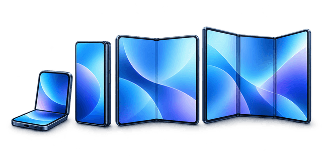
    Foldable hero illustration
    Advertisement

    Foldable screen size comparison

    Cover and inner displays with resolution, aspect ratio, and PPI. Filters refine the view; all devices stay in the page source for search engines.

    9 of 9 devices

    DeviceScreen sizesMain display
    iPhone Duo

    Apple · 2026 · Book

    Cover
    6.3″
    Main
    7.6″

    2670 × 1878

    10:7 · 430 PPI

    Compare this device
    Galaxy Z Fold8

    Samsung · 2026 · Book

    Cover
    6.4″
    Main
    7.6″

    2448 × 1848

    4:3 · 404 PPI

    Compare this device
    Galaxy Z Fold8 Ultra

    Samsung · 2026 · Book

    Cover
    6.5″
    Main
    8″

    2504 × 2256

    10:9 · 421 PPI

    Compare this device
    Galaxy Z Flip8

    Samsung · 2026 · Flip

    Cover
    4.2″
    Main
    6.9″

    2520 × 1080

    21:9 · 397 PPI

    Compare this device
    Pixel 11 Pro Fold

    Google · 2026 · Book

    Cover
    6.4″
    Main
    8″

    2160 × 2076

    20:9 · 375 PPI

    Compare this device
    Pixel 9 Pro Fold

    Google · 2024 · Book

    Cover
    5.8″
    Main
    8″

    2152 × 2076

    1:1 · 374 PPI

    Compare this device
    Motorola Razr 50 Ultra

    Motorola · 2024 · Flip

    Cover
    4″
    Main
    6.9″

    2640 × 1080

    22:9 · 413 PPI

    Compare this device
    Motorola Razr 50

    Motorola · 2024 · Flip

    Cover
    3.6″
    Main
    6.9″

    2640 × 1080

    22:9 · 413 PPI

    Compare this device
    OnePlus Open

    OnePlus · 2023 · Book

    Cover
    6.31″
    Main
    7.82″

    2440 × 2268

    10.8:10 · 426 PPI

    Compare this device
    • iPhone Duo

      Apple · 2026 · Book

      430 PPI
      Cover
      6.3"
      Main
      7.6"
      Resolution
      2670 × 1878 · 10:7
      Compare this device
    • Galaxy Z Fold8

      Samsung · 2026 · Book

      404 PPI
      Cover
      6.4"
      Main
      7.6"
      Resolution
      2448 × 1848 · 4:3
      Compare this device
    • Galaxy Z Fold8 Ultra

      Samsung · 2026 · Book

      421 PPI
      Cover
      6.5"
      Main
      8"
      Resolution
      2504 × 2256 · 10:9
      Compare this device
    • Galaxy Z Flip8

      Samsung · 2026 · Flip

      397 PPI
      Cover
      4.2"
      Main
      6.9"
      Resolution
      2520 × 1080 · 21:9
      Compare this device
    • Pixel 11 Pro Fold

      Google · 2026 · Book

      375 PPI
      Cover
      6.4"
      Main
      8"
      Resolution
      2160 × 2076 · 20:9
      Compare this device
    • Pixel 9 Pro Fold

      Google · 2024 · Book

      374 PPI
      Cover
      5.8"
      Main
      8"
      Resolution
      2152 × 2076 · 1:1
      Compare this device
    • Motorola Razr 50 Ultra

      Motorola · 2024 · Flip

      413 PPI
      Cover
      4"
      Main
      6.9"
      Resolution
      2640 × 1080 · 22:9
      Compare this device
    • Motorola Razr 50

      Motorola · 2024 · Flip

      413 PPI
      Cover
      3.6"
      Main
      6.9"
      Resolution
      2640 × 1080 · 22:9
      Compare this device
    • OnePlus Open

      OnePlus · 2023 · Book

      426 PPI
      Cover
      6.31"
      Main
      7.82"
      Resolution
      2440 × 2268 · 10.8:10
      Compare this device
    Full device index (all foldables)
    • iPhone Duo— cover 6.3″, main 7.6"
    • Galaxy Z Fold8— cover 6.4″, main 7.6"
    • Galaxy Z Fold8 Ultra— cover 6.5″, main 8"
    • Galaxy Z Flip8— cover 4.2″, main 6.9"
    • Pixel 11 Pro Fold— cover 6.4″, main 8"
    • Pixel 9 Pro Fold— cover 5.8″, main 8"
    • Motorola Razr 50 Ultra— cover 4″, main 6.9"
    • Motorola Razr 50— cover 3.6″, main 6.9"
    • OnePlus Open— cover 6.31″, main 7.82"

    Open vs closed display proportions

    Pick up to three models to compare cover and main outlines at a shared scale. Proportional comparison only — on-screen size depends on your monitor and browser zoom.

    iPhone Duo

    Closed (cover)

    6.3" · 14.8 sq in

    Open (main)

    7.6" · 27.3 sq in

    Galaxy Z Fold8

    Closed (cover)

    6.4" · 14.8 sq in

    Open (main)

    7.6" · 28.1 sq in

    Main display area vs first selection: +2.9%

    Galaxy Z Fold8 Ultra

    Closed (cover)

    6.5" · 15 sq in

    Open (main)

    8" · 31.9 sq in

    Main display area vs first selection: +16.8%

    Foldable display rankings

    Rankings are generated from the same specs as the table above. Compactness uses folded width × height in millimeters, not display diagonal.

    Largest inner displays

    1. 1. Galaxy Z Fold8 Ultra8" inner
    2. 2. Pixel 11 Pro Fold8" inner
    3. 3. Pixel 9 Pro Fold8" inner
    4. 4. OnePlus Open7.82" inner
    5. 5. iPhone Duo7.6" inner

    Largest cover displays

    1. 1. Galaxy Z Fold8 Ultra6.5" cover
    2. 2. Galaxy Z Fold86.4" cover
    3. 3. Pixel 11 Pro Fold6.4" cover
    4. 4. OnePlus Open6.31" cover
    5. 5. iPhone Duo6.3" cover

    Sharpest inner displays (PPI)

    1. 1. iPhone Duo430 PPI
    2. 2. OnePlus Open426 PPI
    3. 3. Galaxy Z Fold8 Ultra421 PPI
    4. 4. Motorola Razr 50 Ultra413 PPI
    5. 5. Motorola Razr 50413 PPI

    Most compact when folded

    1. 1. Galaxy Z Flip875.4 × 85.1 mm folded
    2. 2. Motorola Razr 5073.9 × 88 mm folded
    3. 3. Motorola Razr 50 Ultra74 × 88 mm folded
    4. 4. Galaxy Z Fold868.1 × 158.4 mm folded
    5. 5. Galaxy Z Fold8 Ultra68.5 × 162 mm folded

    Why foldable diagonals are misleading

    Phone and tablet screen size is quoted as a diagonal in inches. That single number hides the shape of the panel. Foldables are usually squarer than tall slab phones, so the same diagonal can mean more reading area but less full-screen 16:9 video.

    • Diagonal length does not equal usable area — aspect ratio sets width and height.
    • Book-style foldables trade phone-like height for tablet-like width when open.
    • Video often letterboxes on inner displays; maps, documents, and split-screen apps benefit more from extra area.
    • Cover displays use different aspect ratios than inner screens, so CSS breakpoints should not assume one viewport per device.
    Diagonal versus area versus 16:9 video area
    ExampleDiagonalAspectPanel area16:9 video area
    Large slab phone6.3 inches19.5:914.8 sq in12.02 sq in
    Book-style foldable (open)7.6" inner4:328.1 sq in20.93 sq in
    Compact tablet11 inches4:356.4 sq in46.58 sq in

    Foldable phone types

    Book-style foldables

    Fold like a book: a tall cover phone outside, a wide inner display for multitasking when open.

    Good for: Email, spreadsheets, reading, side-by-side apps

    Filter table by book-style →

    Flip foldables

    Fold vertically like a clamshell: compact when closed, full-height phone when open, with a small cover screen on the outside.

    Good for: One-handed use, selfies, quick glances on the cover display

    Filter table by flip →

    Tri-fold devices

    Multiple hinges unfold into a very wide panel — closer to a portable tablet than a phone.

    Good for: Maximum canvas for creative work and video (fewer models on the market today)

    Filter table by tri-fold →

    Foldable CSS viewport sizes

    We only list CSS viewport widths and heights that have been verified on real hardware. Guessing from resolution and DPR is not reliable on foldables because scaling, cover vs inner modes, and browser chrome differ by model. Use the live viewport checker on your device, or browse verified rows below when available. Open the viewport checker.

    Popular foldable comparisons

    • iPhone Duo vs Galaxy Z Fold8

      7.6" vs 7.6" inner · +2.9% main area

      430 vs 404 PPI · cover 6.3" vs 6.4"

    • Galaxy Z Fold8 vs Fold8 Ultra

      7.6" vs 8" inner · +13.5% main area

      404 vs 421 PPI · cover 6.4" vs 6.5"

    • Galaxy Z Flip8 vs Razr 50 Ultra

      6.9" vs 6.9" inner · -2.4% main area

      397 vs 413 PPI · cover 4.2" vs 4"

    • Pixel 11 Pro Fold vs OnePlus Open

      8" vs 7.82" inner · -5.3% main area

      375 vs 426 PPI · cover 6.4" vs 6.31"

    • Pixel 9 Pro Fold vs Pixel 11 Pro Fold

      8" vs 8" inner · -1.8% main area

      374 vs 375 PPI · cover 5.8" vs 6.4"

    Where foldable displays are heading

    Updated 2026-02-01

    • Cover screens keep growing — enough for full apps without unfolding, not just notifications and widgets.
    • Folded thickness is dropping, so book-style phones sit closer to slab phones in your pocket.
    • Creases are less obvious on newer panels, though they still matter for drawing and high-contrast UI.
    • Peak brightness and LTPO efficiency improve outdoor readability on both inner and outer displays.
    • For developers, foldables mean more breakpoints: narrow cover, wide inner, and sometimes split viewports when multitasking.

    Related guides

    • Most Common Screen Resolutions in 2026: Desktop and Mobile

      On desktops, 1920×1080 remains the volume king, with 1440p and 4K rising on larger monitors. On phones, most panels land in the 1080–1440 pixel-wide range. Here is what that means for everyday use and responsive design.

    • iPhone 17, Air & Pro Max Screen Sizes: Inches, Resolution, PPI

      The iPhone 17 is 6.3 inches, the iPhone Air 6.6 inches, and the iPhone 17 Pro Max 6.9 inches. This chart lists every iPhone 17 model's screen size, resolution, pixel density, aspect ratio, and approximate CSS viewport width.

    • How Screen Size Impacts Web Design & UX: Best Practices Explained

      Learn how screen size affects web design and user experience. Discover best practices for responsive layouts and improving engagement across devices.

    • Best Dual Monitor Setup Size: How to Pick Screen Sizes That Actually Work Together

      For most people, the best dual-monitor setup is two 27-inch monitors at 1440p. It gives you a large, matched workspace without overwhelming a normal desk. Tighter desk? Go 24-inch pairs. Heavy multitasking? Consider 27-inch plus ultrawide.

    • 100dvh vs 100vh: Fix the Mobile Full-Height Bug

      On phones, 100vh often counts space behind the browser UI, so full-height layouts jump or overflow. 100dvh follows the visible viewport. Use this guide plus the live CSS viewport units tool to pick vh, dvh, svh, or lvh.

    • Samsung Galaxy S25 & S26 Screen Sizes: Inches, Resolution, PPI

      The Galaxy S25 measures 6.2 inches and the S25 Ultra 6.9 inches. This guide lists every Galaxy S25 and S26 model's screen size, resolution, pixel density, aspect ratio, refresh rate, and approximate CSS viewport width in one chart.

    Foldable screen size FAQ

    What is the largest foldable phone screen?
    Among foldables in our database, Galaxy Z Fold8 Ultra has the largest inner display at 8" (2504 × 2256, 421 PPI). Rankings update when we add new models.
    How is a foldable phone screen measured?
    Manufacturers measure the active display diagonally in inches, usually excluding rounded corners. Foldables are rated separately for cover and inner panels. Our table lists both where available, plus resolution and derived PPI from those specs.
    Does a foldable phone have two screen sizes?
    Yes. Book-style and flip foldables have a cover (outer) display when closed and a larger main display when open. Each has its own diagonal, resolution, and aspect ratio — treat them as two different layout targets for apps and websites.
    Is a 7.6-inch foldable larger than a 7-inch phone?
    A ~7.6" foldable inner panel is often squarer than a 7" tall phone or mini tablet. In our data, iPhone Duo inner area is about 27.3 sq in versus 31.7 sq in for the iPad mini (7th gen, A17 Pro, 2024) — roughly 13.9% less area despite similar diagonals. Video in 16:9 still letterboxes on the foldable.
    What is the difference between a cover and inner display?
    The cover display is what you use when the device is folded shut. The inner (main) display opens for the full canvas. Cover screens are narrower; inner screens are wider on book-style foldables. PPI, refresh rate, and brightness can differ between the two.
    Does the crease reduce usable screen area?
    The crease is a physical fold line, not subtracted from the marketed diagonal. It can affect touch and visibility along a thin band in the middle. UI safe zones and game controls sometimes avoid the hinge region even though the full resolution is still available.
    Do websites need special breakpoints for foldables?
    You need layouts that work at both narrow cover widths and wide inner widths — often the same techniques as responsive design for phones and tablets. Test real viewports with our breakpoint checker; do not assume one CSS width per foldable model.
    What CSS viewport size does a foldable phone use?
    It depends on which display is active and how the browser reports CSS pixels. Cover and inner modes differ, and system scaling changes `window.innerWidth`. We only publish CSS viewport sizes when verified on hardware; otherwise use the live viewport checker on your phone.

    Explore more tools

    • All devices

      Full phone, tablet, and monitor database

    • Foldable comparison table

      Cover and inner screen sizes in one place

    • Compare devices

      Pick any two models side by side

    • Screen resolution checker

      Read your panel resolution live

    • Viewport checker

      Live CSS viewport width and height

    • Breakpoint checker

      Test widths against Tailwind breakpoints

    • PPI calculator

      Pixel density from size and resolution

    • Aspect ratio calculator

      Width, height, and ratio conversions

    Compare with confidence

    See every screen detail side by side before you buy

    Check size, resolution, pixel density, and key specs in one clean comparison view.

    Compare hundreds of phones, tablets, laptops, and monitors.

    Seline Analytics